Did you know that nearly 90% of the first impression your brand makes is based on the colors you are using? Would you choose the same ones if you knew that? Are you aware of the positive and negative signals that every color transmits to most people?
Much after this first impression come the incentives for interaction and purchase that businesses are trying to influence through their choice of visual identity and color palette. If you have ever wondered why most promo stickers are in red, luxury brands are black or you love your favorite brand’s color so much, this is not a coincidence.
Which color makes you hungry? Which one makes you calm down? Which one inspires you? Let’s see if most people feel the same about it.
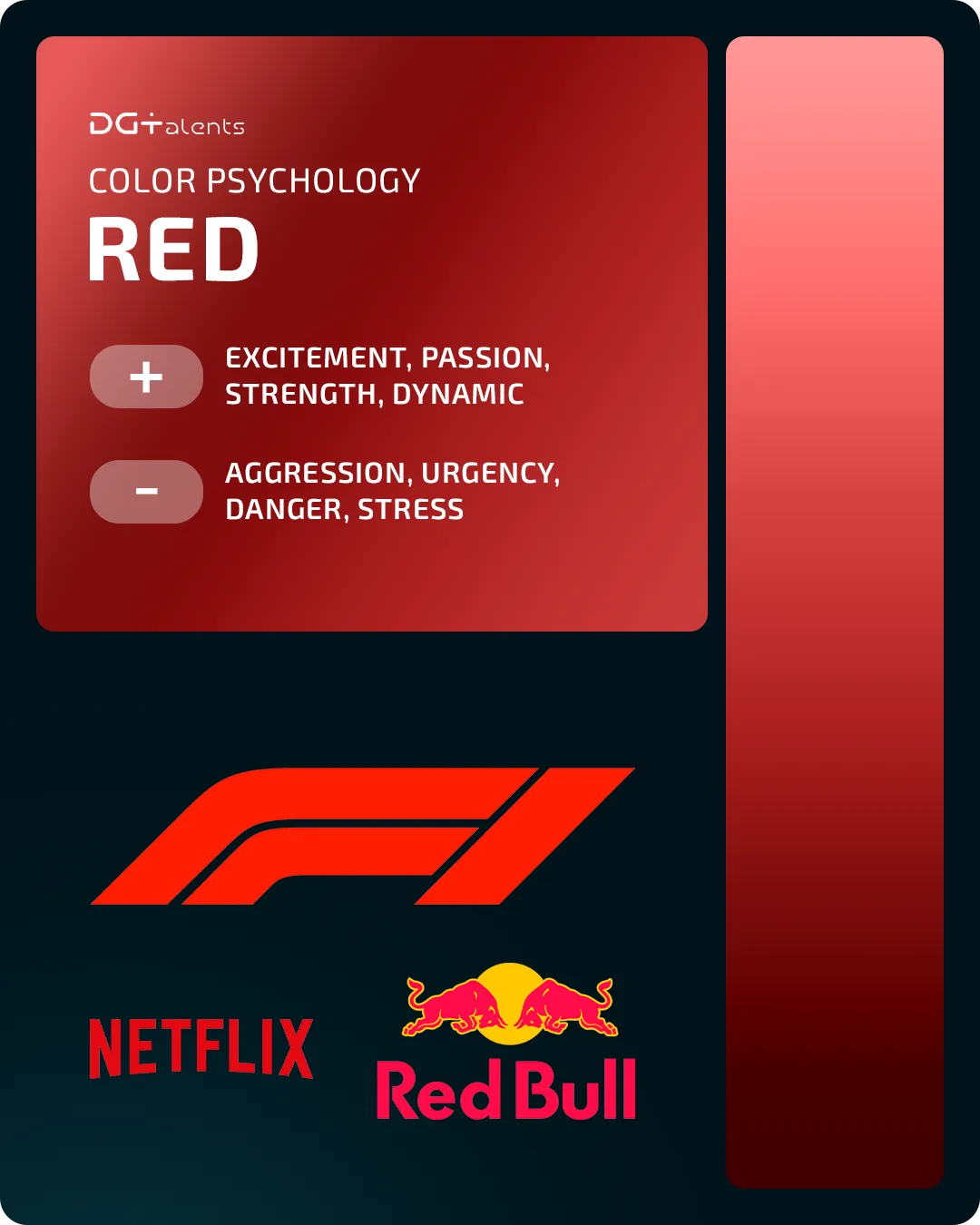
Red: Aggression, Power, Passion, Urgency, or Hunger
Red color can increase your blood pressure or speed up your heart rate. Here is why it is often associated with excitement, dynamics, aggression and passion, even though it can also indicate urgency and attract attention. It is also proven that red stimulates appetite, but can also be used to flag danger.
Here is why you can easily imagine the fast sports car, the fast food restaurant or the caution road signs we know, all in red.
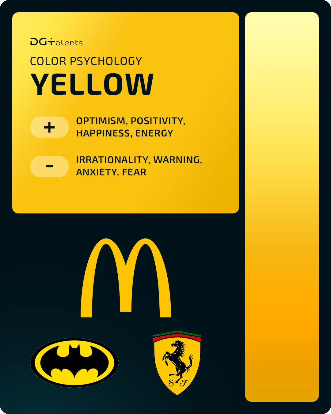
Yellow: Best to Highlight, Alert, or Give Impulse
If you have already recalled that not all promotions and discounts are in red, then you are probably thinking about yellow, as well. This color is the one that stands out attracting the human eye the most and is often used to provoke impulsive irrational responses by users, or to alert them of a certain danger. Some of the positive signals of yellow are related to the sun, and thus, to optimism and happiness.
Many brands that relate their experience to happy and smiling customers are using yellow as a main color for their branding. Others, often in the B2C segment, rely on yellow to attract attention and stand out from competition.
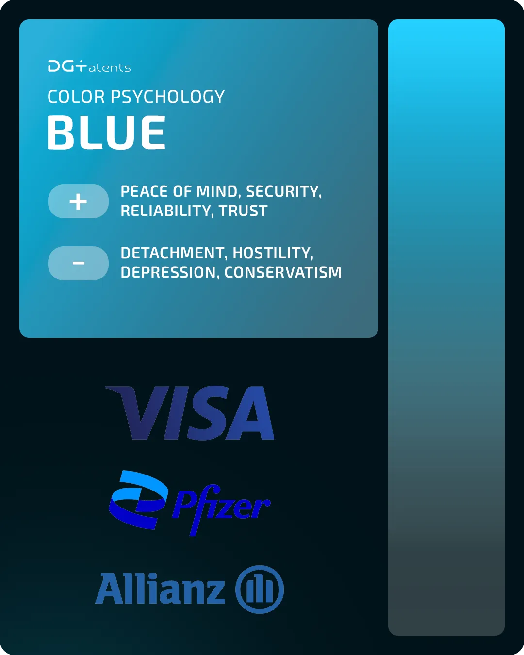
Blue: People’s Favorite Color
Blue is proven to be the world’s favourite color and is also the third primary color, along with red and yellow. If you think of the blue in water or in the sky, you could easily guess why this colour relates to calmness, security, and reliability. However, blue can also indicate distance, coldness, or hostility, especially if compared to other colours.
You would easily spot the blue in the logos of many social media, businesses, and organizations for which trust, security, and safety of data and users is a top priority.
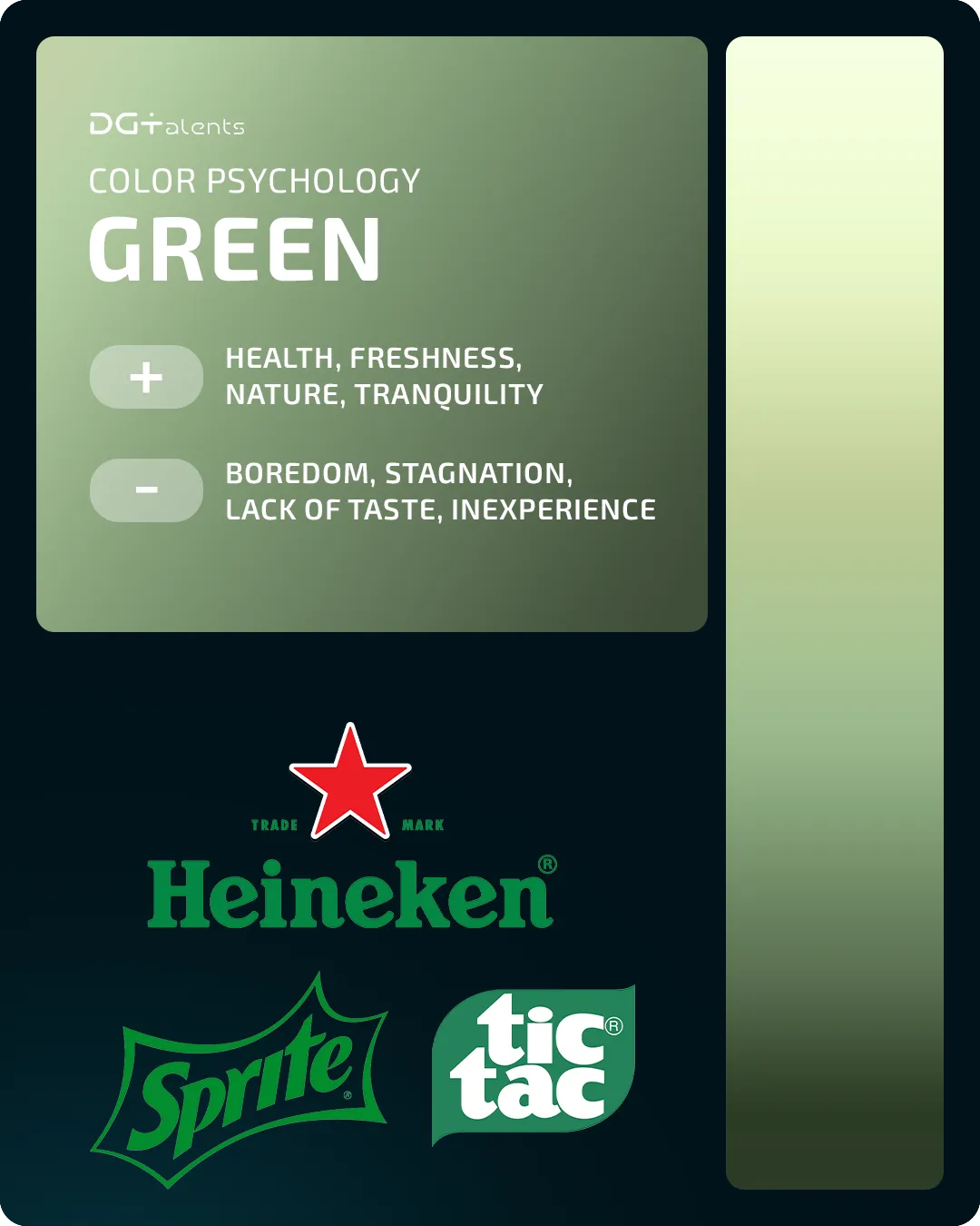
Green: The Symbol of Life
If you want to associate your brand with health, freshness, nature, calmness or bio origin, you would probably choose green as your brand’s main color. Often, calmness and sustainability are valued by companies that seek trust and security by clients. However, some people might find it boring or even symbolizing lack of taste. You could easily ignore those negatives if your business is in pharmacy, bio or eco-friendly production, where green dominates by default.
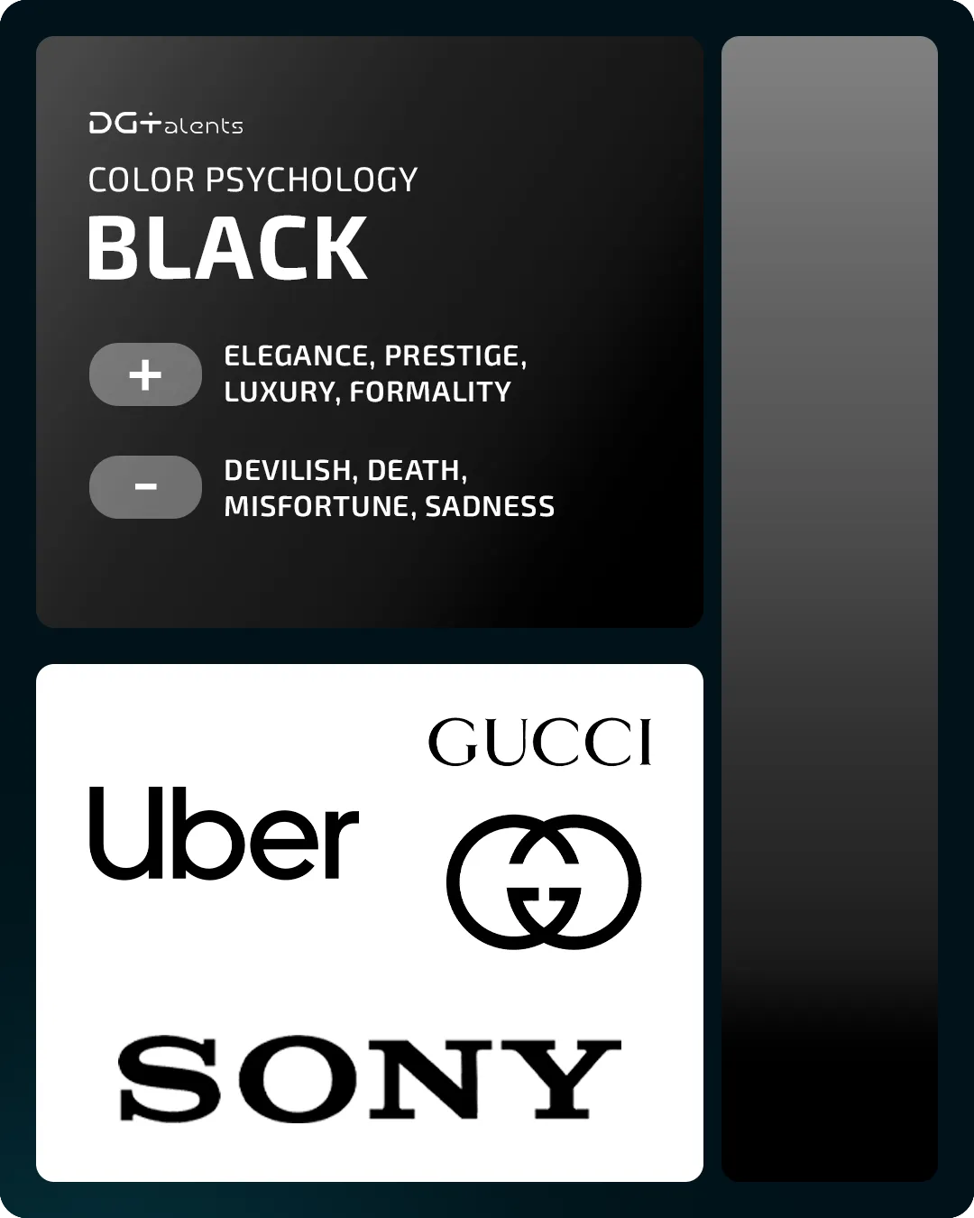
Black: High-Tech and Luxury
Black is also a symbol of power and strength, but is most often used by luxury brands and by a third of the tech ones. Usually this is the color used by companies to brand elegant or high-end products with examples being countles: Apple, SONY, GUCCI, PRADA, Dior, Cartier…and many more.
It is also good to consider when black is not the best choice for the brand’s industry. In many cultures black resembles devil, death, and misfortune which would hardly make it appropriate for a business in healthcare or insurance, for example.
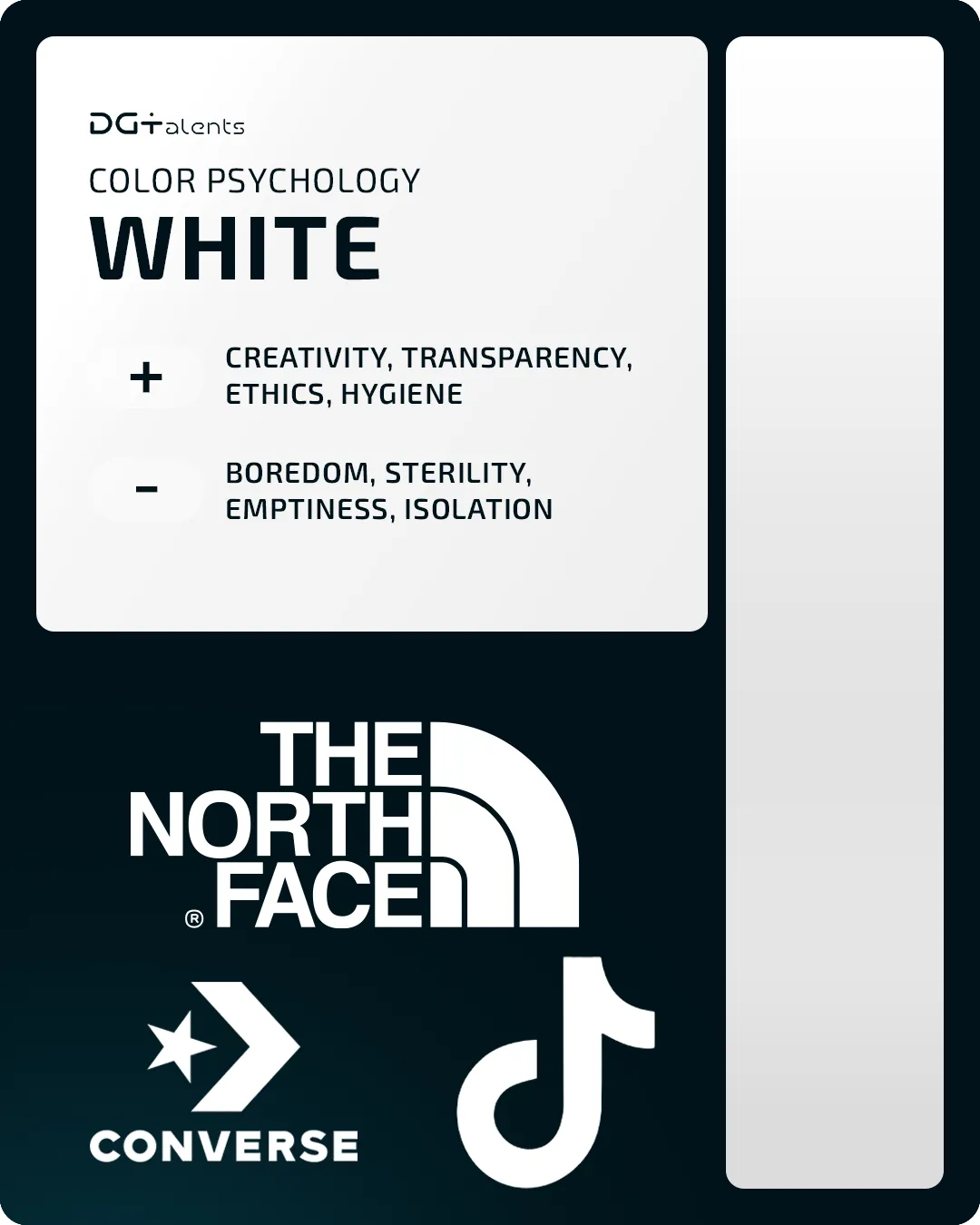
White:Pureness, Intellect, Professionalism
It is not a surprise that doctors or scientists are often in white symbolizing their good intent and professionalism, as well as a new beginning. This color is good for brands that value creativity, transparency and ethical approach and are not afraid of being perceived as too boring, sterile or simple.
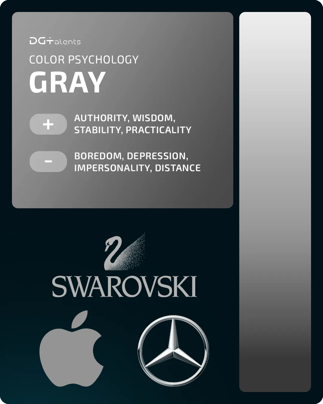
Grey: Experience and Dignity
Grey can dominate for brands that would like to stand out with authority and wisdom, just like people at higher age do. On the other hand, some people find the color too boring or depressing which you would hardly want your creative or innovative brand to be associated with.
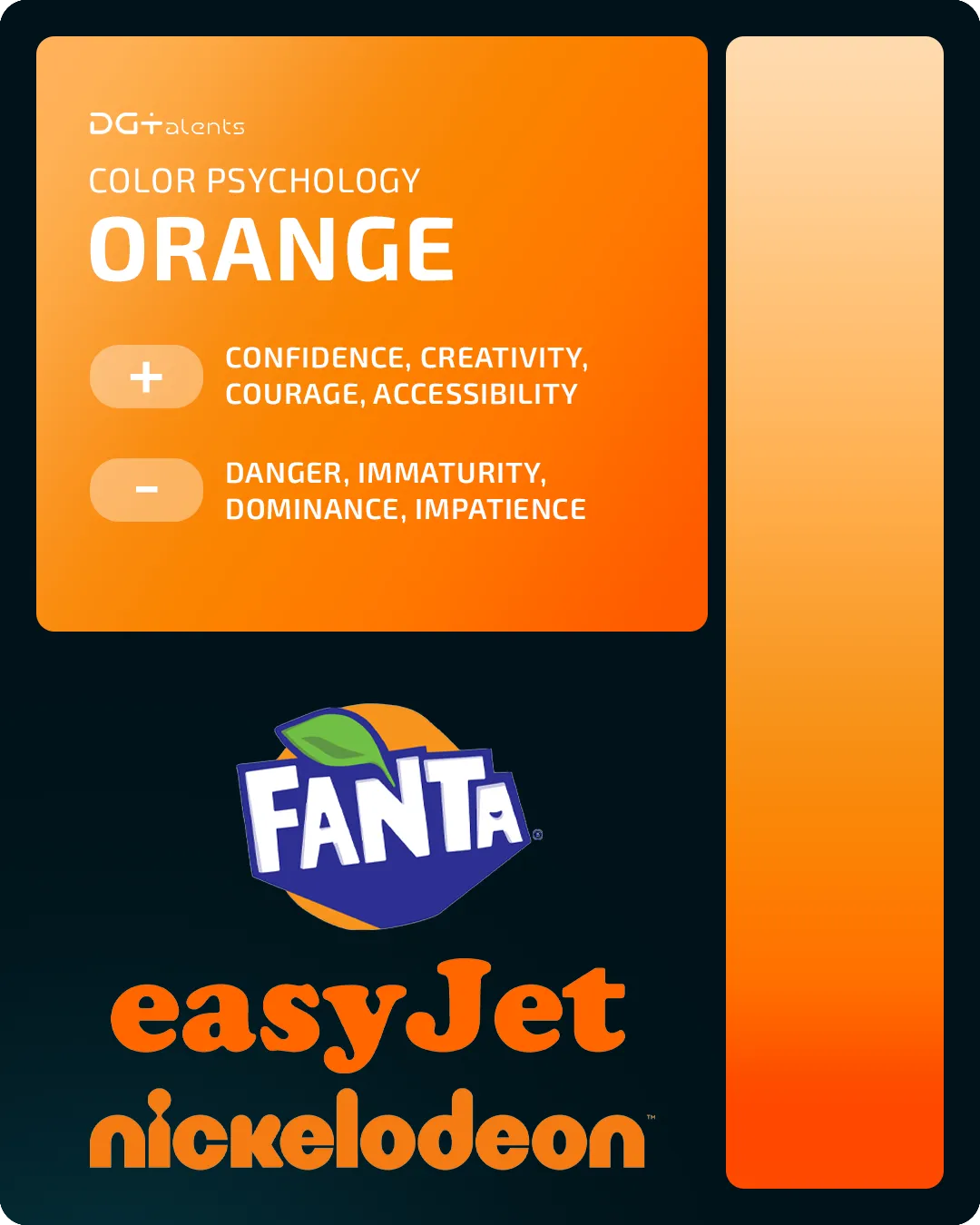
Orange: Symbolize Accessibility
Confidence, creativity, courage, or accessibility. All these give the reason why many brave brands dare to use orange. This color is also one of the most popular for CTA buttons used in web design to stimulate impulsive decisions, just like red and orange where it comes from.
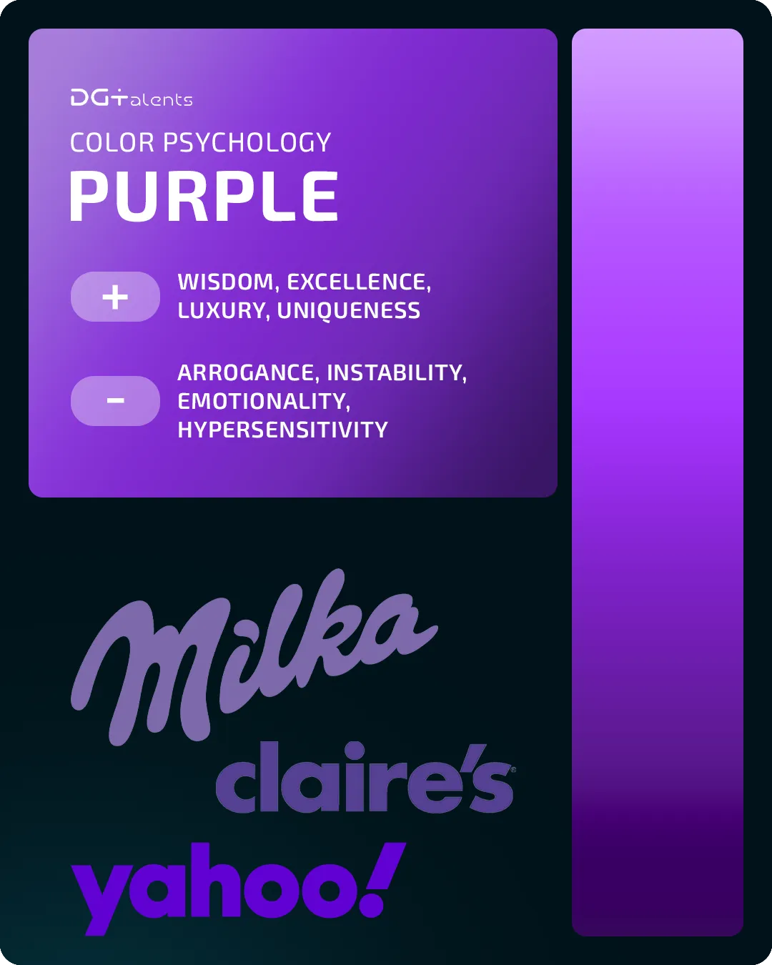
Purple: Supremacy of Royalty
Wisdom, supremacy and luxury lifestyle are just a few of the associations that purple had been bringing for ages. You would rarely find it in nature and this is why many royal families have been using it to communicate uniqueness and individuality. Queen Elizabeth I even banned people from wearing purple clothes if they were not members of the royal family.
This color is popular in the cosmetics niche, but in almost every other it can help a brand stand out, as it is rarely used.
Does Your Brand Have the Right Identity?
Let’s go back to the question in the beginning knowing what different colours stand for: Do you make the right first impression with the colours your brand is using?
Have in mind that colours are only a part of your visual and brand identity which is usually planned much in advance.
Learn more: Building an Impactful Brand Identity Using the 12 Brand Archetypes
If you are just planning the setup or rebranding of your business, get in touch with DGTalents Marketing Agency for brand building, marketing strategy, and an end-to-end concise approach towards positioning your brand on a desired market. We will take care of the ideation, planning, execution, and development of your business in the digital and offline world, helping you stand out with your ideas, products, and solutions.
Get in touch with the team for a free marketing consultation